Monthly Archives: October 2014

Do SSDLC Programs Really Work, or: How to Measure Success (4)

This is the last post in a series of posts where we discussed a few Secure Software Development Lifecycle (SSDLC) metrics that I personally find very interesting. The four metrics are:

  1. The number of qualified defects found per quarter
  2. The number of qualified defects fixed per quarter
  3. The difference between [1] and [2], that is, inflow vs outflow
  4. The overall number of open qualified security defects

In this post, I will share the last metric of the series, which is a graph of the overall number of open qualified security defects, and their development over time. This data is taken from the same organization and product set discussed in the first post of this series, and it has been anonymized, randomized, and transformed into a relative scale to protect confidential information without affecting the trends that are typically seen when starting a new SSDLC program. All percentages in the graph are relative to the results of the 20 Quarters before the SSDLC program was started.

Overall Number of Open Qualified Security Defects

The graph below shows how the overall number of open qualified security defects developed in the example organization. All percentages in the graph are relative to the results of the first 20 Quarters. The organization started out from a backlog of 100% of open issues, and continuously added to that backlog over the following 9 quarters. The backlog peaked at 242% of open issues, and then started to decrease slightly. This means that R&D teams more than doubled their security defects backlog, despite the great increase of fixes they released in the same time, which is a very impressive achievement.

2014-09-19 - Security Defects Metrics - Graph 4

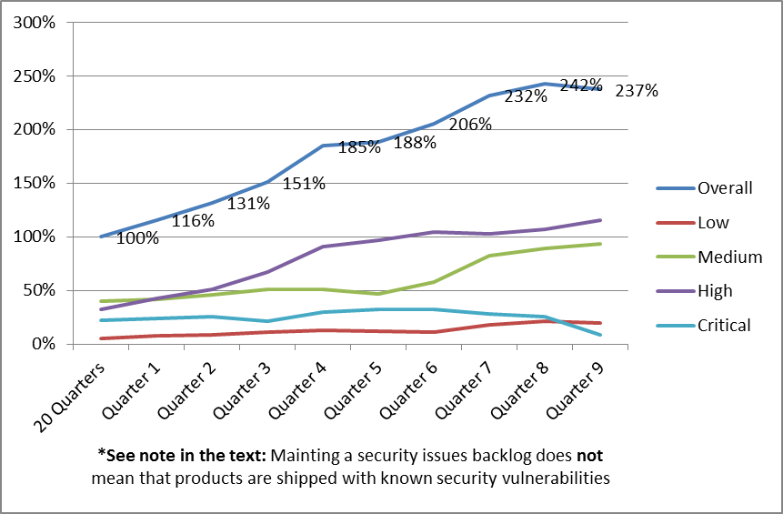
The graph shows that the teams did a good job of keeping the number of critical issues in the backlog consistently low, and even managed to significantly reduce the number of open critical defects in Quarter 9.

We can also see from the graph that in Quarter 9, the teams managed, the first time in more than 7 years (all for which data is available for this organization), to reduce the size of the overall security backlog. This is obviously very much aligned with the inflow/outflow metric, where Quarter 9 shows a negative inflow (or a net outflow) of security issues in the backlog. This is a big achievement, and a good indication that the SSDLC program was solidly embraced by the organization’s senior leadership as well as by the organization’s engineers.

*Important: Note that an organization maintaining a security issues backlog does not necessarily mean that the organization releases products with known security vulnerabilities. Companies such as Hewlett-Packard have strong business ethics, and do their best to protect their customers from all known and unknown security risks. If a security defect in the backlog affects a version or platform that has not yet been released, or may manifest itself as a vulnerability only under certain operating conditions that are not present in supported setups, then a security defect may be backlogged without increasing the security risk for the customer.

For example, a library that is being used in a product may have a defect in input validation, thus leading to a buffer overflow in the library, ultimately affecting the product using the library. The SSDLC process would discover such an issue and track it as a security defect in the backlog. However, the “supported setup” for this library may be that it is only to be used in a product that performs its own input validation before passing any user provided data to the affected library method. As long as the library is being used in this “supported setup”, there is no security vulnerability in the final product, which means that the security defect in the library does not result in a security vulnerability and hence does not translate into a security risk for the customer. Still, the security defect of the library is being tracked in the backlog, so that a fix for the library can be obtained, or the library can be replaced.

Next Steps

One goal of an SSDLC program is to reduce risk and increase confidence that security issues are properly handled. Backed by this confidence in the SSDLC process and the quick turnaround times on security issues an organization will eventually achieve, the leadership team may define new Service Level Agreements (SLAs) for open security issues.

For example, an organization may establish strict SLAs with time windows in which security defects would have to be fixed (issue qualified, defect fixed, patch tested, patch delivered / publicly available). The organization may split this up in a matrix for low / medium / high / critical severity and the source of the defect (internally found / reported by customer under NDA / publicly known). Ideally, the organization should define another metric on how well they delivered against these SLAs, making them true security professionals!

Do SSDLC Programs Really Work, or: How to Measure Success (3)

In the first post of this series, we discussed a few Secure Software Development Lifecycle (SSDLC) metrics that I personally find very interesting. The four metrics are:

  1. The number of qualified defects found per quarter
  2. The number of qualified defects fixed per quarter
  3. The difference between [1] and [2], that is, inflow vs outflow
  4. The overall number of open qualified security defects

In this post, I will share some inflow / outflow metrics, and their development over time. This data is taken from the same organization and product set discussed in the first post of this series, and it has been anonymized, randomized, and transformed into a relative scale to protect confidential information without affecting the trends that are typically seen when starting a new SSDLC program. All percentages in the graph are relative to the results of the 20 Quarters before the SSDLC program was started.

Inflow vs Outflow

The inflow / outflow metric gives a good indication on how successful an organization is in dealing with newly found issues: can they qualify and address security defects fast, or are they overwhelmed by the influx of new issues, and just keep piling them onto a backlog?

2014-09-19 - Security Defects Metrics - Graph 3

This graph shows the difference between the number of incoming new defects and the number of defects that have been closed in the same time period. Like in the previous illustrations, the graph shows relative numbers (percentages) in relation to the results of the first 20 Quarters. Unfortunately, this makes the graph a little harder to read, because the percentages do not directly translate into the actual number of issues that have been added to the backlog. In this graph, big positive percentage numbers mean that work is added to the backlog. A negative percentage number (or a number close to 0) is desirable, because this means that the team is ahead of or at least keeping up with the influx of work.

This graph shows two peaks, which is a very common characteristic for organizations where multiple groups contribute to finding security problems, but only one group is fixing them. If we compare this to the two graphs we discussed in the previous post, we can explain the first peak by a large inflow of defects, which the developers are not yet prepared to handle. After about 12 months into the program, the engineers are starting to catch up. This is very common, and a good sign, because it reflects the learning and training that the developers have to go through to know how to deal with the findings, and then the developers applying these learnings and starting to catch up with incoming work. This first peak is usually always present when rolling out a new SSDLC program.

The second peak is very typical for an organization with dedicated QA teams or security pen testing teams. Once these teams have been ramped up, completed their training, and are fully operational, their reporting output picks up significantly – typically also after 12 months. Other than the R&D team (who may also report more defects against their code), they are usually not chartered to fix the issues they discovered. This leads to additional pressure on the developer team, and the developer team must adjust (again) to the higher influx of security issues. Once this adjustment is complete (Quarters 8 and 9), the organization reaches an ideal state of close to zero or negative inflow / outflow difference.

The graph also reveals how an organization is prioritizing work. In this case, the organization is rightly prioritizing work on critical security issues. However, we can also see that they are focusing on medium and low severity problems first, before addressing high severity issues. This may be justified, for instance if crucial resources who can deal with the high severity problems are not available as they are assigned to work on the critical severity defects, or if some of the higher severity defects are not manifesting as security vulnerabilities (e.g. due to defense in depth covering them), allowing delays to fix lower-severity problems that do lead to security vulnerabilities. This metric makes potential prioritization problems visible and actionable.

Edit: continue reading…

Do SSDLC Programs Really Work, or: How to Measure Success (2)

In last week’s post, we discussed a few Secure Software Development Lifecycle (SSDLC) metrics that I personally find very interesting. The four metrics are:

  1. The number of qualified defects found per quarter
  2. The number of qualified defects fixed per quarter
  3. The difference between [1] and [2], that is, inflow vs outflow
  4. The overall number of open qualified security defects

In this post, I will share metrics and a graph of the number of qualified security defects that have been fixed, and their development over time. As mentioned in the previous post, the data used to plot the graphs has been anonymized, randomized, and transformed into a relative scale. These transformations are necessary to protect confidential information, but have been performed in a way that does not affect the trends that are typically seen when an SSDLC program is rolled out. All percentages in the graph are relative to the results of the 20 Quarters before the SSDLC program was started.

Number of Qualified Defects Fixed per Quarter

The graph below is a hypothetical metric of the same organization discussed previously, in the same time period. It shows the anonymized and transformed results of the efforts the organization went through to close security defects.

2014-09-19 - Security Defects Metrics - Graph 2

As with the previous graph, we see a slow start. However, once the number of newly discovered defects grow, the fix rates start to go up. There can be many reasons for this behavior. Common reasons for this are typically a combination of buy-in to the program by executive management and buy-in from engineering: In a mature software organization, engineers take responsibility for their deliveries, and create pressure to deal with critical issues rather than delaying them. Often, engineering programs are most successful if both factors are present.

In the organization we use in this example, we see that R&D fixed more (about 35%!) qualified security defects in a single quarter than they did in the previous 5 years, which is an efficiency increase of several thousand percent – and this organization was still in the growing phase during Quarter 9!

Edit: continue reading…